Contact Centre Dialer
0-to-1 Ecosystem
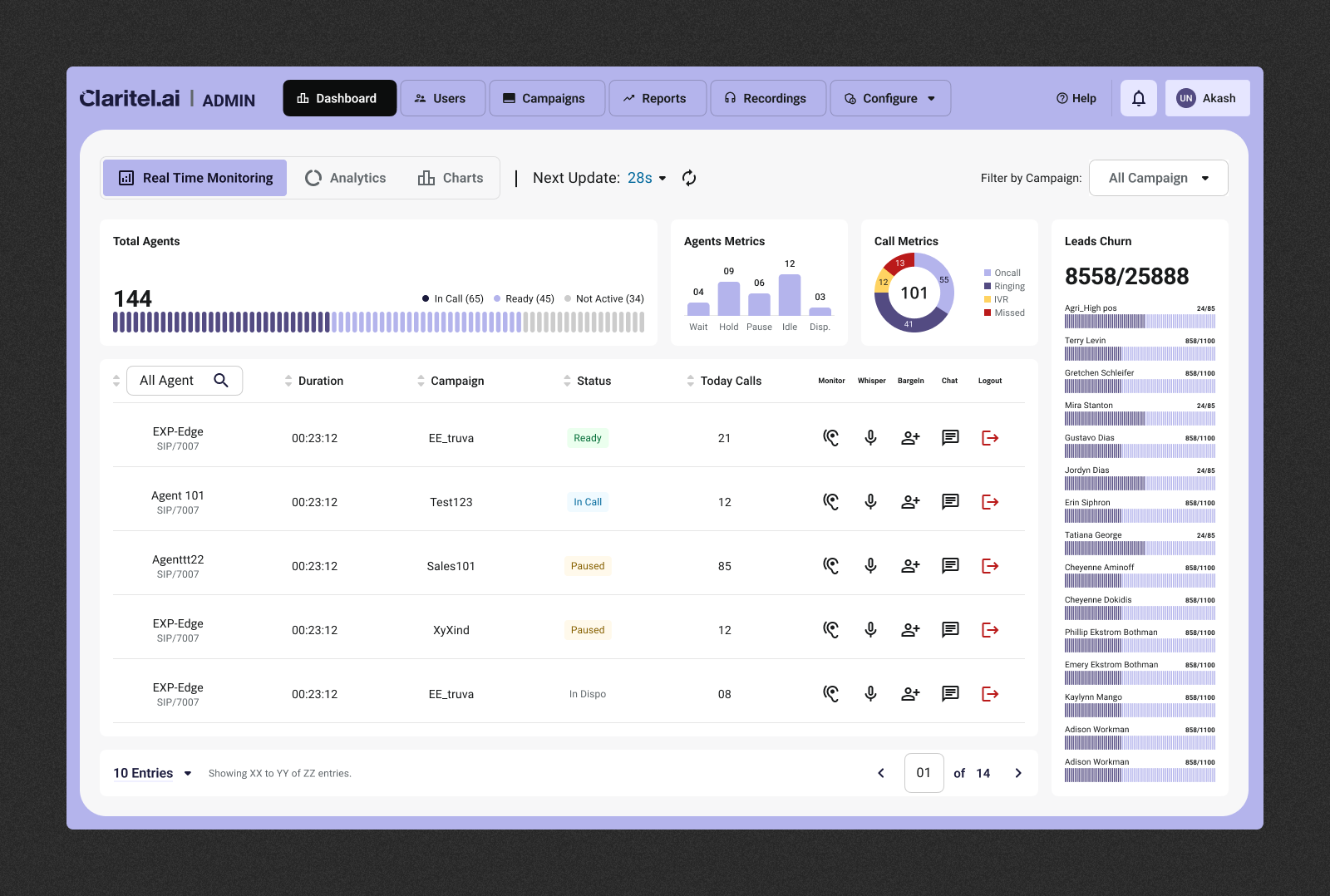
Claritel.ai
Product Strategy, UX/UI, Brand
Identity
Claritel is redefining the B2B telephony landscape. We partnered with their founding team to architect a complete product ecosystem from scratch—transforming a complex technical premise into a market-ready platform.
Five dimensions where rigour, mathematics, and systems thinking shaped every decision.
01
Scalable architecture — designed for entropy
02
Accessibility as a mathematical commitment
03
Personalisation at the data layer
04
Analytics designed as narrative, not inventory
05
Validation as foundation, not finish line
7 ± 2
Nav items (Hick's Law)
≥ 4.5:1
Contrast ratio (WCAG AA)
≥ 0.75
Data-ink ratio (Tufte)
−34%
Time-to-insight, validated
Engineering a flow state inspired by Formula 1 and gaming paradigms.
Let's talk.
Have a project in mind? Send me a message and I'll get back to you within 24 hours.
Email
[email protected]